

Black box trading sounds mysterious and scary for many. Tall tales of machines running amok or making mistakes that wipe out accounts make for good movies, but the reality is often much simpler. All good traders use rules to provide structure to their trading. This helps regulate emotions so they can make decisions quickly under duress. Often, the guardrails reflect the personality of the traders themselves. The levels of aggression, holding period, and complexity all factor into the setup. Depending on the inputs driving returns, they may build a system to execute their strategy. Technical indicators lend themselves to this more easily than fundamental ones. The Efficient Market Theory says that price incorporates all the known information for a stock or commodity. Therefore, making decisions based on just that can make sense. We delve into a few common indicators using this principle to explain why this might be effective.
Key Technical Indicators
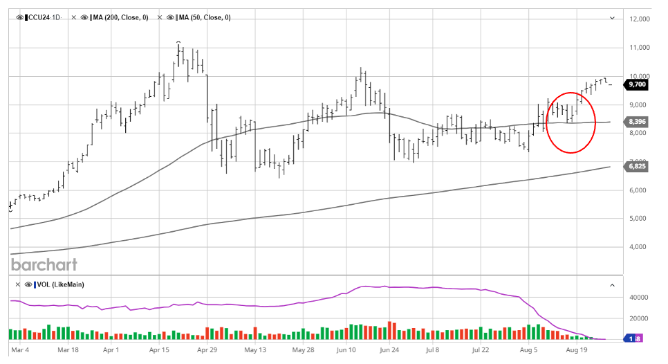
Moving averages
Popular versions include the 50-day and 200-day moving averages. This line is the average price of a commodity, stock, index, or contract over that period. Below is a chart for cocoa showing both averages. The lower line is more stable and shows that we are running well above the 200-day moving average, whereas the 50-day moving average adjusts to more recent movement. We can see that in August, the commodity encountered support at this level and resumed its climb. A market above the moving average is often said to be trending higher and below, indicating the potential for a short opportunity.
Support and Resistance
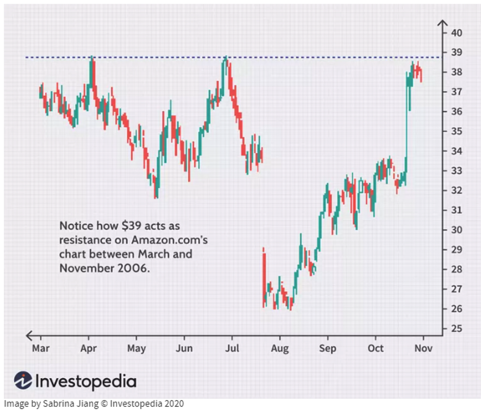
Over time, patterns emerge that show prices where traders become interested in buying or selling. Much of this can be driven by ideas used by many, such as the 50-day moving average above. It can also be broken down into smaller periods, using volume data or trend lines drawn at the top and bottom of a pattern to identify resistance levels above the market or support below the market. Sometimes, a price will stall at a round number, such as the S&P reaching 5000. Opportunities exist to buy or sell at these inflection points. A larger move will often occur once these levels are breached and a new pattern is established. An example of resistance is below.
Relative Strength
A Relative Strength Index (RSI) often identifies overbought or oversold conditions. To calculate, one must choose a specific time (usually 14 days) and then find the average daily gain divided by the average daily loss. These are plotted on a scale of 100, with a value above 70 typically considered overbought and below 30 as oversold. Traders can use these values to take profits or re-enter trades based on prevailing market conditions. One benefit of the RSI is that it can adjust quickly to large moves based on its relatively short time frame. A slowing RSI might show that a bullish trend is ebbing, and an increasing RSI might indicate a reversal of a downward trend.
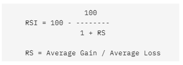
Chart Patterns
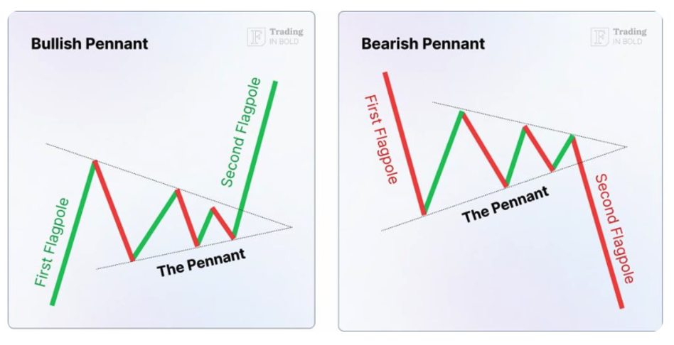
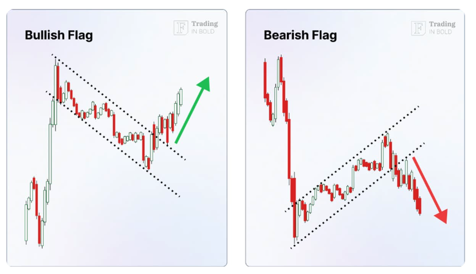
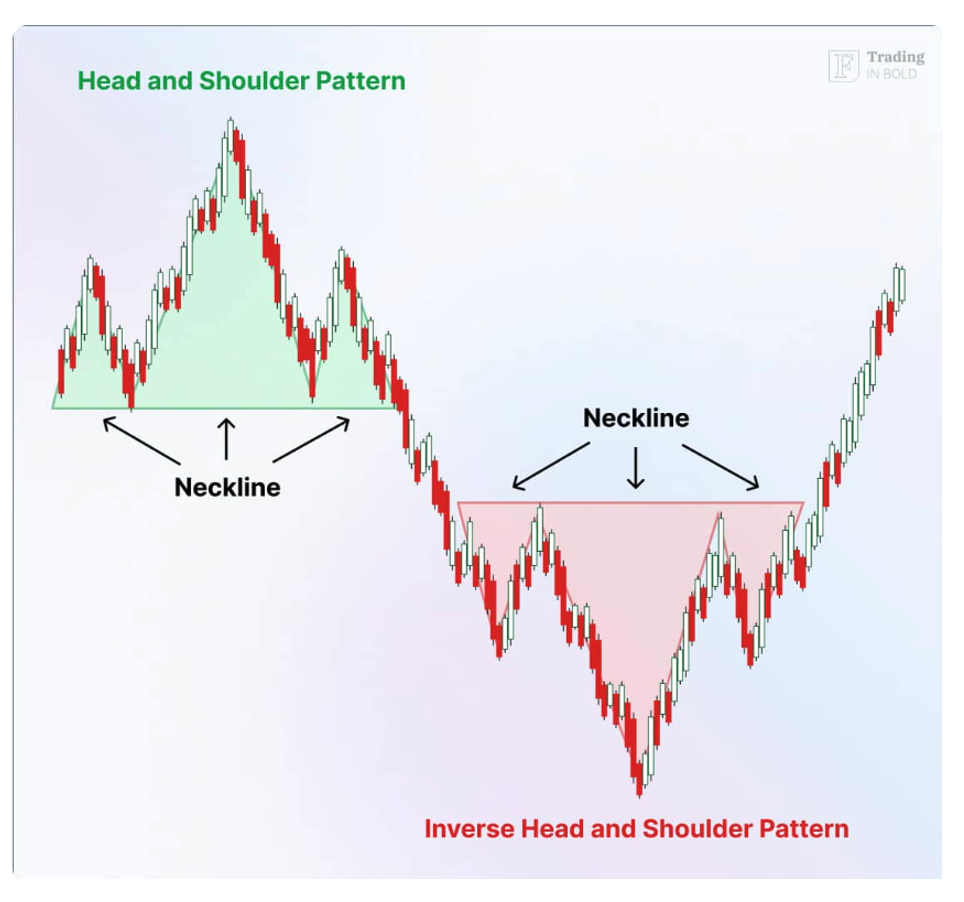
Price movement is often driven by investor psychology. While not a perfect science, this can drive consistent patterns over time. The pennant formation below shows a consolidation period after a larger move. Think of it as a breather where everyone pauses to determine the next step. Returns become narrower before breaking out to the upside or the downside. Flag formations show investors selling a rapid rise or buying a sharp drop. The trend continues upon another breakout of the trend channel. A head and shoulders pattern or a double top are two more popular patterns traders view. To learn more, please visit the Finbold site.
Bullish and bearish pennants
Bullish and bearish flags
Head and shoulder formation
Creating a Systematic Trading Strategy
One can see how a systematic trader can employ the math involved in many of these indicators. Often, we see a combination of these inputs used to create a trading algorithm. A simple system might combine the 200-day moving average with the 50-day average and an RSI value with equal weight. When the values cross a threshold, the trader establishes a long or short position. The combination of these ideas and their relative weight, along with proprietary indicators, makes or breaks a strategy.
Additional Strategies and Considerations
In a complex world, the most brilliant people find ways to simplify information. Finding market drivers, reliable indicators, and tradeable sectors can get a CTA off to a good start. No signal works all the time, so risk management is key. Viewing the market through the view described here might help make more sense of why the market behaves the way it does. Other strategies include Bollinger Bands, Fibonacci sequences, and volume tracking, which might be topics worth researching if you find this interesting. We offer a variety of systematic traders employing ideas like this that could make sense for your portfolio. Please reach out if you think yours is one of them.
Photo by Belhadj lamine on Unsplash
Related Posts

Race to Nowhere: Markets Pause Before the Next Big Move
Running on a treadmill is one of my least favorite activities: you expend a lot of energy but end up exactly where you started, only out of breath. So far in 2026, financial markets are behaving similarly. There’s intense activity, but the major indices have gone almost nowhere. As of mid-February, the S&P 500 is […]

Systematic vs. Discretionary Trading: Which Strategy Is Right for Your Portfolio?
Investors face many choices when selecting investments. Historically, the main divide was between fundamental and technical trading. The growth of computer systems for trading has introduced a potentially larger variable that will only increase as AI advances, whether in systematic (rules-based) or discretionary (human judgment) trading. In just my 20 years working in the industry, […]

The Evolution of Trading from Systematic to AI
Is AI the next step in the evolution of trading? History proves new tools storm the markets, then high adoption erases their edge. What can futures trading history teach us about AI’s trajectory? The 1980s: Rise of Rules-Based Trading Building on simple regression models that aimed to identify patterns across sectors, the 1980s showed that […]