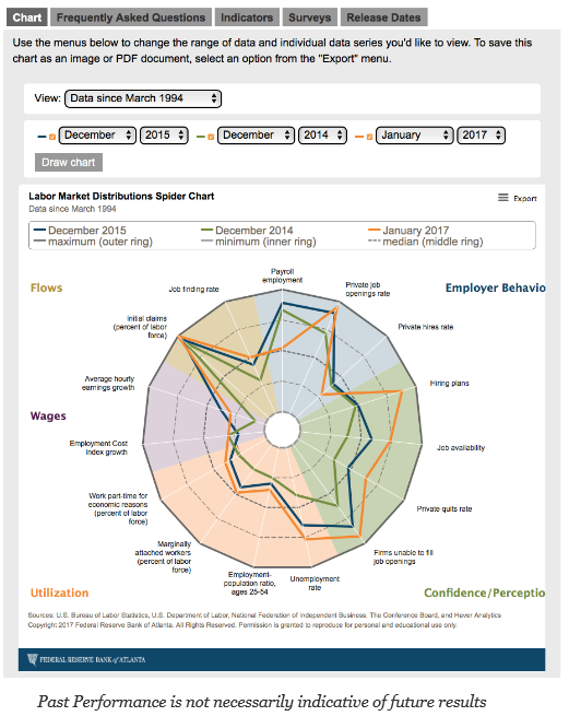
There are a lot of labor statistics to analyze to measure what may happen with fed policy and interest rates. One of the key problems is trying to place all of this information on a single page or in a visual format that can do proper comparison with the past and provide analysis of the present. The Atlanta Fed has achieved that goal with their new labor spider graph.
I compared the current number with end of year numbers for the last two years. There is no question that the labor market is strong but there is still an issue with labor utilization that should be addressed. There are too many potential workers not in the labor force or workers not working to their potential. This may be one of the reasons for why real wages have not grown as fast as expected. This issue is not a monetary problem that can be controlled through low lending rates but something that is more systemic. There seems to be demand for workers but the skills don’t match market needs. This is where targeted fiscal action could be helpful if done properly.
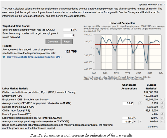
The Atlanta Fed also has produced a tool called the Jobs Calculator. It can tell us our ability to hit a target unemployment rate based on factors such as labor force participation and population growth. This tool may be hard to use to help with making asset price decisions, but it provides an idea on the complexity of the labor issue.


