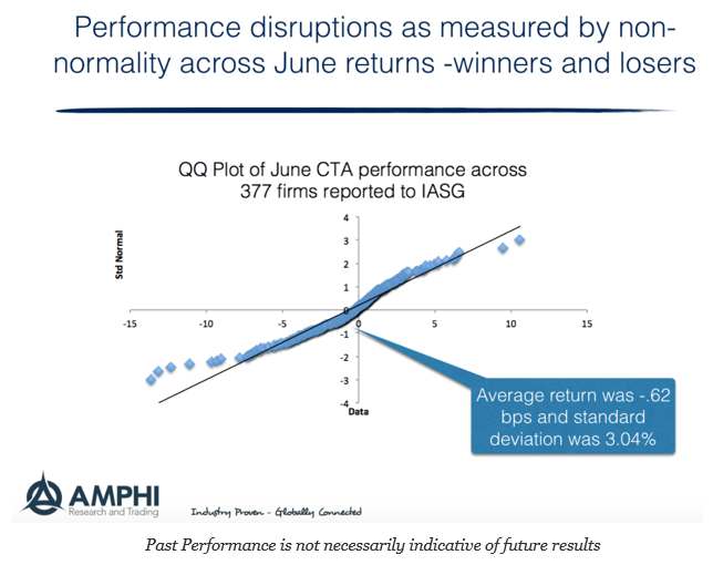
What kind of month was June for CTA’s? Well, you can look at the distribution plot of returns for the month to get an idea of the extremes. We created the QQ plot for the 377 firms that reported to the IASG database for June as of last week. This can be done for smaller more specialized samples, but we took the maximum set of data reported to IASG.
A QQ plot is a comparison of the quantiles of a set of data to test the distributional properties, specifically its uniformity. A uniformed distribution, like a normal, will find data on the straight line.
It was a bad month for many CTA’s with much larger than expected loses and with a negative skew or tilt, yet there were some clear winners for the month. The power of diversification and the wide choice among managers shows that not all CTA’s are alike even within some standard classifications. Some of the big winners were associated with commodities which did not suffer from the whipsawing seen near the end of the month in equities nor the change in bond direction. Bigger losers were those firms focused on trends in financials. Interestingly, many of the poor performers were also hitting max drawdowns. While more formal distribution tests reject normality, the performance numbers were often consistent with 10% annualized volatility, but a locational mean that was much lower than expected from historical averages. The spread was expected, the average was not, and a few headline at the negative extreme.

