The new paper The Rate of Return on Everything, 1870-2015 is a mammoth piece of research on gathering information on rates of return back through history. It seems like such a simple issue but producing this work required painstaking and diligent focus on obscure databases. This work is not often rewarded in the economics profession yet has powerful use.
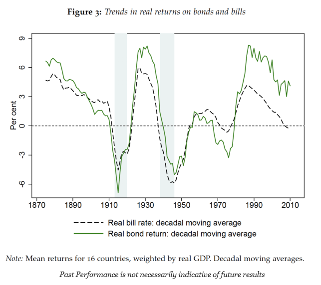
I want highlight some of the graphs which can be very helpful for making long-term judgments on the return direction for financial assets. The first graph focuses on the real rate of return for bonds and bills over the last 100 plus years.
High real rates of return on bonds are unusual with only three relatively short periods of real returns over 5%. The same can be said for the safe asset of short-term bills. There are long periods where the safe asset will generate negative return. However, the truly negative periods are tied with global wars when there is no safety with financial assets.
On a real basis, there is no safety in the safe asset. We can expect that bills will have returns that hover around zero or less most of the time especially in the post WWII period. Also, don’t expect much from your bonds going forward if you use history as a guide. Real rates are unlikely to go up toward 1990’s levels.
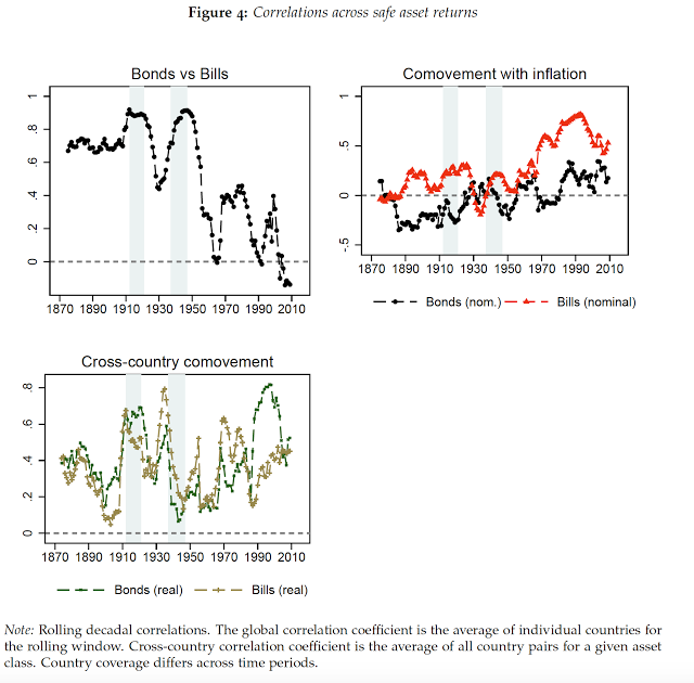
The correlation between bonds and bills has historically been much higher and current levels are at all time lows. The co-movement between bonds and inflation has been on an upswing. The cross-country co-movement for both bills and bonds is usually positive but can have some very large fluctuations; nevertheless, there can be value with playing carry around the world.
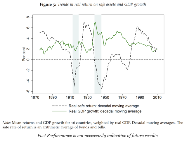
GDP growth over the period of analysis has become less volatile albeit trending lower, but the real returns on safe assets, the average of bonds and bills, have seen significantly more variation that seems independent of GDP growth.


