

“There are three kinds of lies: lies, damned lies, and statistics.” This famous quote from Mark Twain seems like it would be old news over 100 years later but in a world with more data at our fingertips than ever before, it is hard to know if we see the truth or more damned lies. The world Is waking up to the idea that the press, our politicians, and even academia push their own agendas when sharing information. The best we can do is understand the limitations of the data we receive and compare it against our own eyes and ears. More importantly, we now need to question the motivation behind the people publishing the data set. We look to a few recent examples to understand the issue.
Case Study: Congressional Budget Office (CBO) Projections
In February, the Congressional Budget Office (CBO) released an estimate for a $1.5 trillion deficit for 2024. This week, that estimate was adjusted to $1.9 trillion, a massive increase of 27% in just four months. Naturally, this “miss” propagates into the future, pushing debt projection to over $50 trillion by 2034. This will increase interest payments to 4.1% of GDP by that time. Given that the CBO needed to revise its outlook twice within the first half of 2024, can we believe their projection ten years from now?
Gross Domestic Product (GDP) Calculations
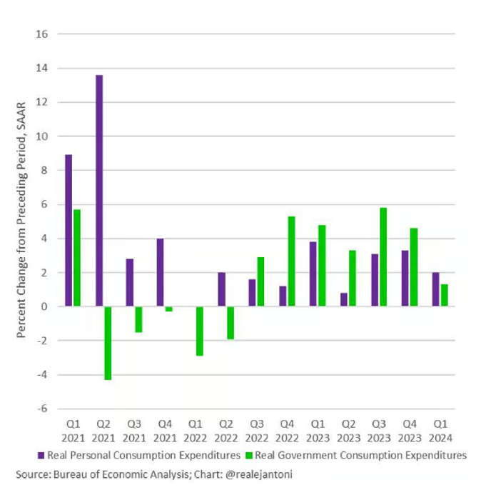
Digging further into government data reporting, we move on to gross domestic product (GDP) calculations. I often use GDP data as a general barometer of the economy, signaling growth or contraction. Perhaps naively, I assumed this figure is driven by business and productivity in the private sector. Political campaigns utilize these numbers extensively to tout success or failure; however, government spending is an underlooked component of the figure. In fact, much of the recent gain can be traced directly to the spending referenced by the CBO in their reports above. Starting in the latter half of 2022, the growth of government expenditures outpaced the change in personal consumption in six of seven quarters. While personal consumption still drives most of the calculation, few would argue that more borrowing-induced spending from the government is the path to long-term success.
Inflation Data and Consumer Sentiment
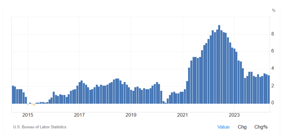
Recent wins related to “taming inflation” will be a talking point throughout the campaign season as well. While the massive increase from February 2021 to June 2022 is ebbing, the sustained rate above 3% is almost 50% higher than the rates that lasted from late 2008 until 2021. The 9.1% peak was last attained in 1981. We often point out that inflation is cumulative, so the effects of the spike continue to compound at the current 3.4% rate annually. This is perhaps why skepticism abounds about where we are in the fight against rising prices. Other reasons exist as well, once again we dig into the data.
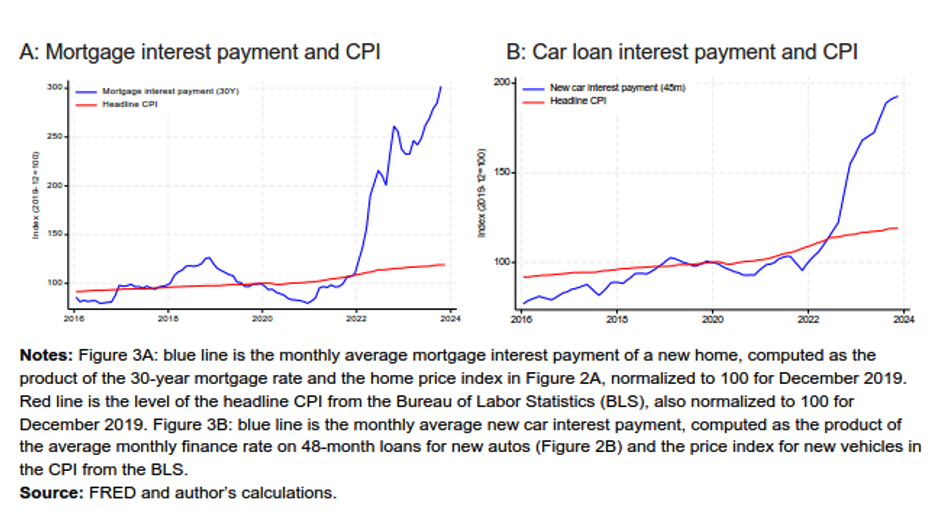
Thinking of the everyday experience of consumers, we look at the largest items in their budget, including their main living expenses. We immediately see a few items missing from the calculation. “Non-consumption” items related to housing do not make it into the formula. These include interest costs, property taxes, insurance, maintenance, and improvements, which are instead counted as “investments” for reporting. These rules apply to auto purchases as well. Therefore, the monthly payments for both categories might be significantly higher, but the increase is not reflected in CPI. This idea is addressed in a paper by the National Bureau of Economic Research written by Larry Summers and others.
This paper, “The Cost of Money is Part of the Cost of Living: New Evidence on the Consumer Sentiment Anomaly,” [PDF] addresses the gap between the economy and consumer sentiment. Low unemployment and falling inflation typically cause high confidence, but this time, it is not. They opine, “Consumers, unlike modern economists, consider the cost of money part of their cost of living.” This makes sense, with monthly mortgage payments tripling and car payments rising 80% compared to the pre-pandemic period. The image of this disconnect shown on the chart below is stark. This reality, combined with “shrinkflation,” rising energy prices, and a general feeling that we are headed in the wrong direction, matches the ShadowStats estimates of double-digit inflation for the past two years.
Employment Data Accuracy
Finally, we look to employment. Investors eagerly anticipate the monthly jobs report, which they believe will give clues as to potential rate cuts. These announcements from the Bureau of Labor and Statistics (BLS) routinely beat expectations only to be revised downward the following month. In 2023, this occurred almost every period. Compared to the BLS quarterly reports, which are more complete, the end-of-year number showed an overstatement of jobs by 777,000. A large number, even in a country with over 300 million people. Some of this discrepancy can be traced to lower response rates over time. Many also believe that part-time jobs replace better full-time jobs or that multiple job holders are masking more significant underlying problems. Surveys count full-time and part-time employment equally. Fed Chair Jerome Powell did not help manners when he said there may be an argument that job creation is” overstated.”
Sadly, the saying, “People make up their minds and then choose their news,” is more accurate than ever. Unfortunately, we can now add that the figures they use to validate their position can also be chosen. It is possible that the pandemic affected how we live in a way that is not reflected in surveys yet. Getting this fixed should be a high priority. That would require our leaders to push for these changes. Why would they do that when the lies, damned lies, and statistics work in their favor? It is time for us all to dig deeper into the data.
References
- CBO Raises Its 2024 Deficit Forecast 27% to Nearly $2 Trillion
- Is The Global Inflationary Depression Already Here?
- Measuring Price Change in the CPI: Rent and Rental Equivalence
- The cost of money is part of the cost of living: New evidence on the consumer sentiment anomaly
- Alternate Inflation Charts
- Biden’s Job-Growth Disappearing Act
- Jobs numbers overstated? What to know about Fed Chairman Powell’s comments
Photo by Pascal Bernardon on Unsplash